

Unsolicited redesign of H-E-B’s mobile app
Interactive pop-up
60% expected upsell conversion increase
10-15% expected online revenue increase
15-20% expected recurring customer increase
My role
Product design
User research
Low fidelity wireframes
High fidelity prototypes
Usability testing and iteration
Copyright
All product photos included are copyrights to H-E-B
Platform
Native mobile application
Challenge:
Limited campaign experience
As one of the nation’s oldest grocery stores, H-E-B fully embraces innovation. With top-notch private labels, over 420 stores, and genuine efforts for local communities, H-E-B has earned a special place in every Texans’ heart.
Although H-E-B regularly promotes online campaigns like its competitors, these campaigns’ experience is very limited.


The shopping experience in current campaigns is still very traditional with very little user-control
In this project, I will analyze at HEB’s online sale strategies, research user demographics, habits, needs to identify revenue growth opportunities, strengthen customer relations, attract and retain more loyal customers. This project will focus on the current H-E-B app.
To define the problem, I first conducted heuristic evaluation, competitor analysis for the current product, then researched HEB customers with interviews, usability sessions to observe them use the product.
The research was analyzed to reveal their habits and pain points to help further lead the solution.
Heuristic evaluation:
Diamond in the rough
I thoroughly used the website and mobile app, while two elements caught my attention by providing user convenience:
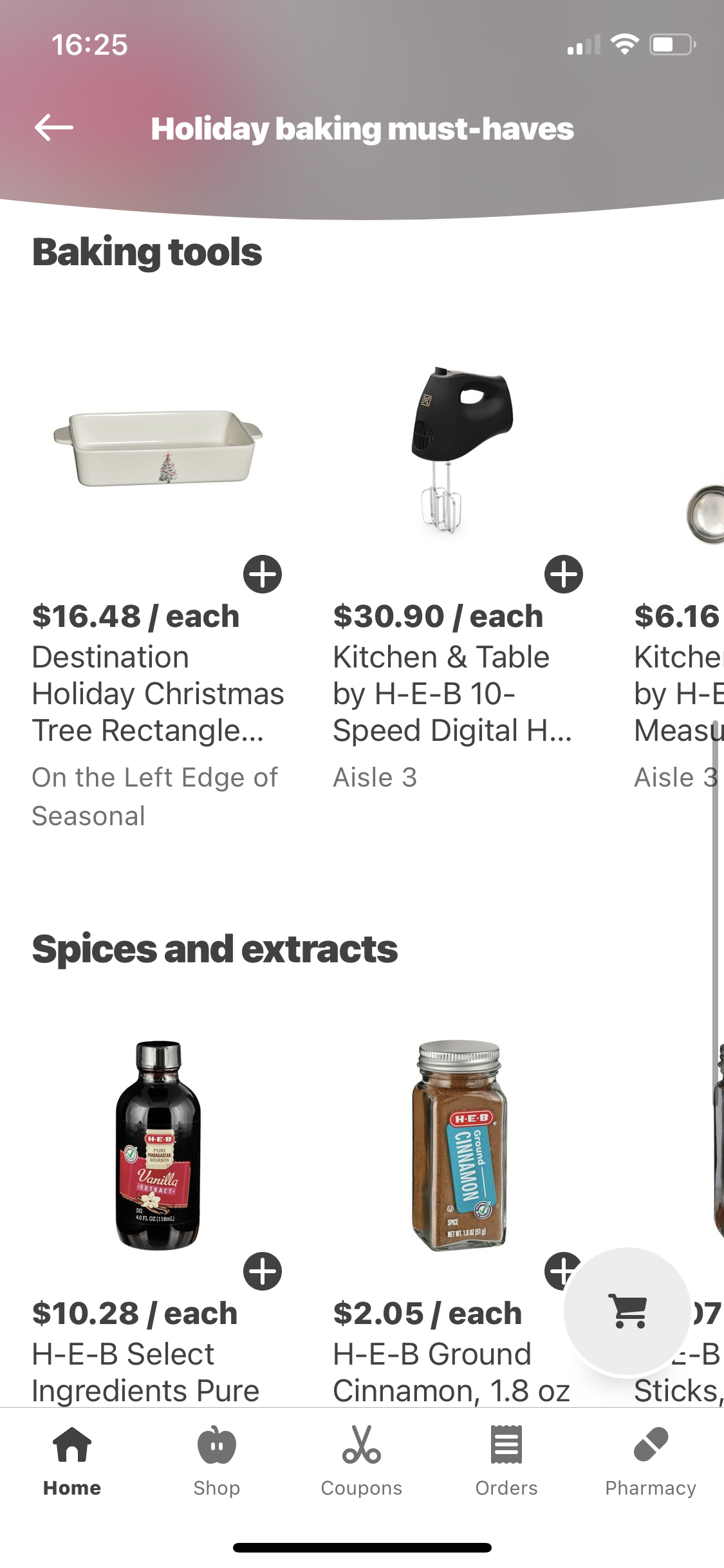
Holiday Diners
A box of dry ingredients for making a Holiday dish.

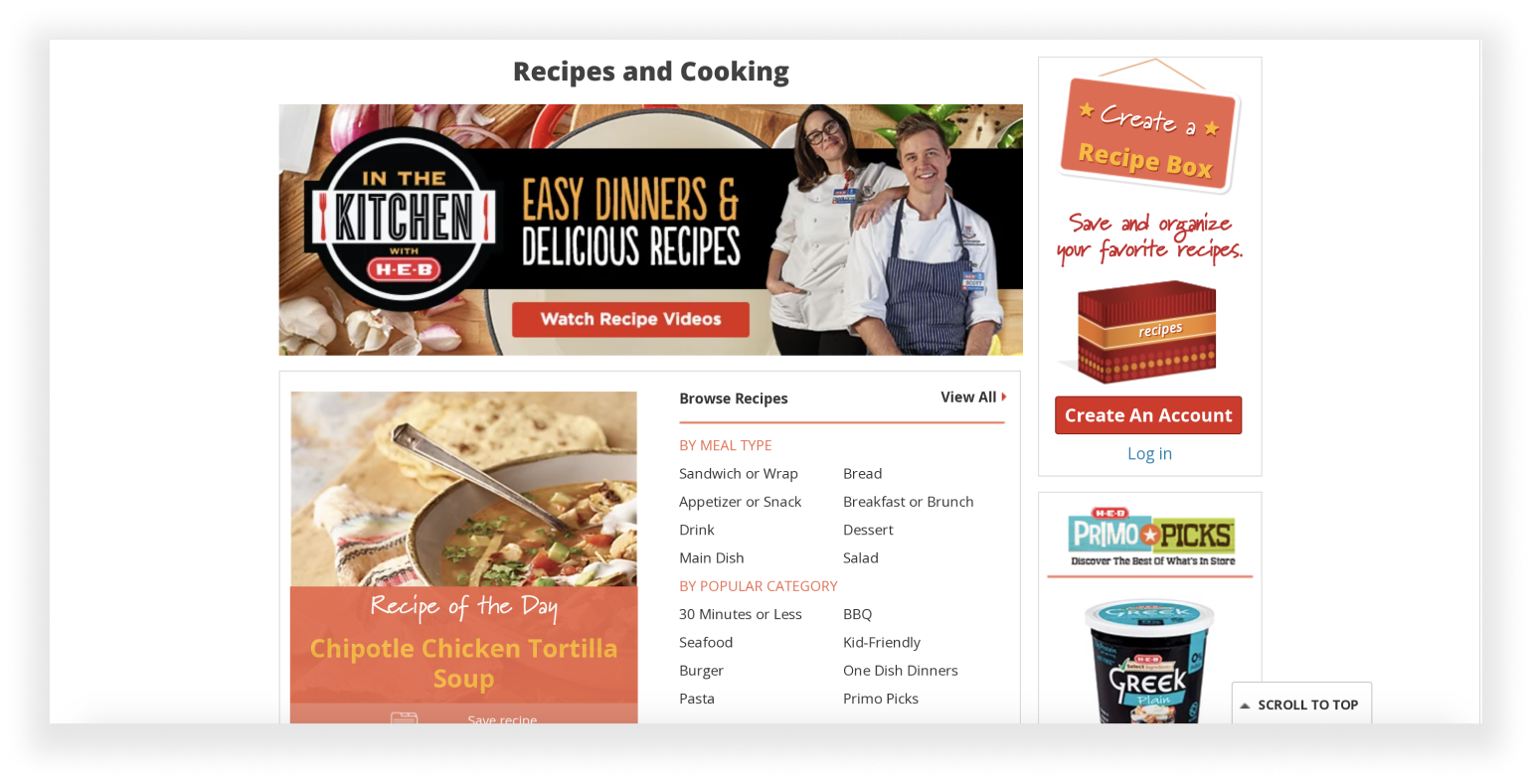
Recipes
Users can add all ingredients into their shopping list, then move everything to shopping cart.
The recipe feature is only available in the desktop site, with very general options, the “recipe of the day” also does not update.
As a supplier for ingredients, I want to see how HEB can expand these features to better improve the customer experience.
A study by Verified Market Research indicated recipe apps are gaining rapid popularity: I saw an opportunity to design a recipe shopping feature for the app. But more confirmation is needed.
Competitor analysis:
I researched the top three competitors from asking 10 H-E-B customers, focusing on their promotional campaigns and recipe features.
Their campaigns posed some common issues: inconsistent user flow, difficult to navigate, either limited or overwhelming choices, and poor user-control.
User interview and current product usability session:
Time to get talkin’!
I interviewed 8 H-E-B customers about their opinions on new recipes, where and how they shop, their online shopping experience, and to try the current recipe feature.
I strategically started the interviews with casual questions to establish trust before going into the in depth questions.
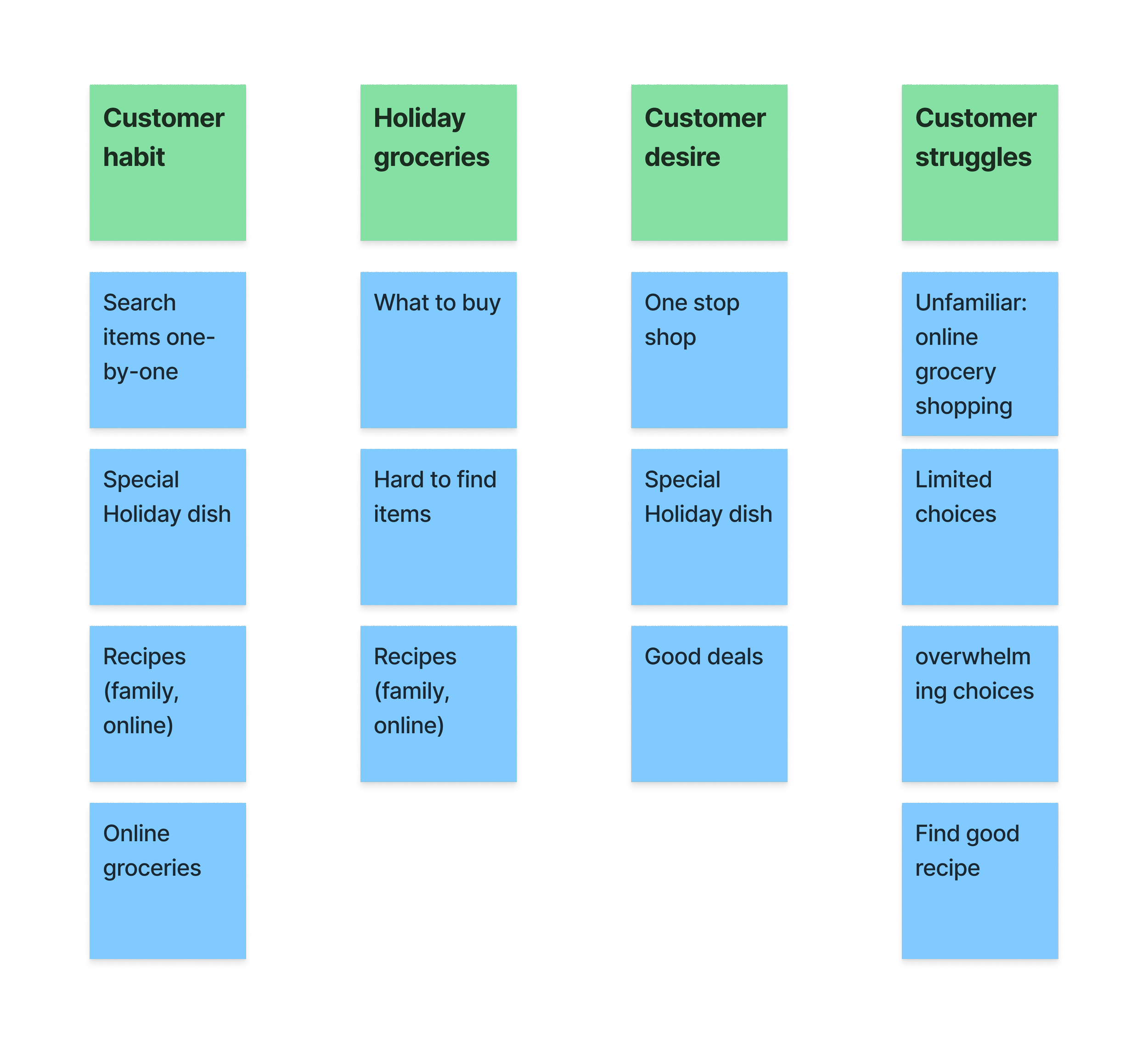
6/8 customers like the idea of new recipes, but it’s risky, while shopping for ingredients takes time.
7/8 customers think shopping for unfamiliar ingredients is challenging.

Unfamiliar
On mobile, 6/8 customers did not engage with the promotional campaigns.
Frustrated
On mobile, the app’s recipe campaigns has limited choices and use horizontal scrolls.
Good feedbacks
On desktop, participants likes the convenience of adding all ingredients with one click.
Inconvenient
On desktop, add ingredients to a list is confusing and inconvenient by requiring 3 page jumps.
After analyzing interview notes, the problem has surfaced: how to design a recipe shopping experience for busy urban and suburban customers, so they not only feel comfortable trying new recipes, but also make it a habit?
What about personas?
I have created two personas from the ethnographic information from my interviews, but decided to not use them, because:
The customers were extremely diverse in terms of age, cultural background, profession, family size, gender, etc.
At the time of this project, personas felt discriminative, I have loosely referred to two personas during the project.
User research:
Ready to go shopping?
I tasked 5 customers to demo how they shop for their recurring groceries, while also shopping for new recipe ingredients on mobile.
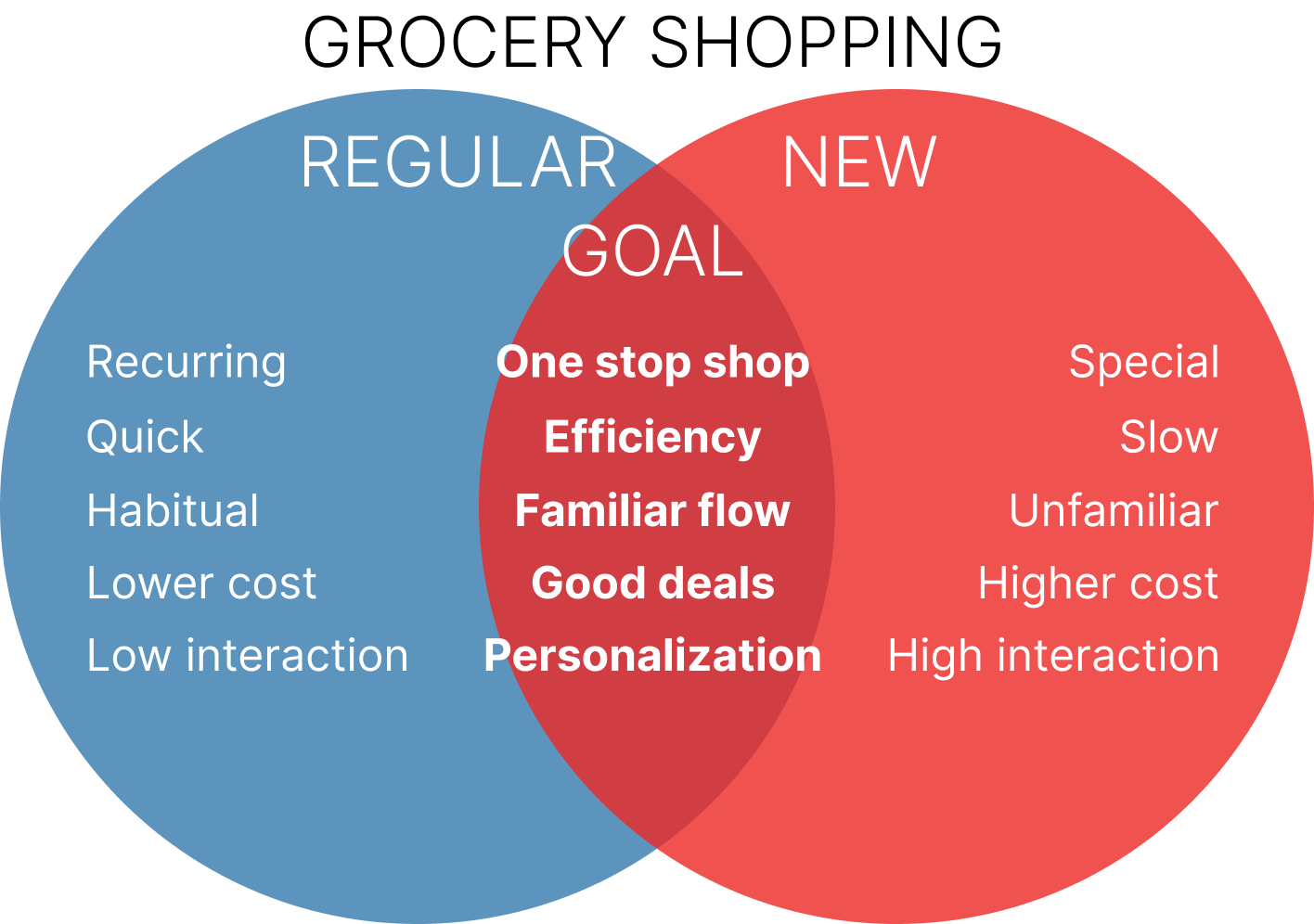
Almost everyone was able to quickly complete their recurring groceries, however, when it comes to new recipe ingredients, they slowed down.
Need more guidance
While shopping, customers didn’t know what and how much to buy without a handy reference.
Need shortcuts
Customers tried the mobile recipe campaign said it “doesn’t have anything, and is “too complicated to use”.
Rushing makes mistakes
2/5 participants had missing or incorrect ingredients while double checking, and the app didn’t allow item cancelation.
This study helped to define their habit and mental model. Now time to design a flow that work for them, not against them.
Study shows on average, upsells increase customer lifetime value (CLV), with a 60-70% success rate to existing customers.

Current upsell
The current upsell appears before checking out, during the task, only 1 out of 5 participants used it, most think this upsell have items they already bought.
From user research insights, I believe a customized upsell will open doors to a good recipe shopping experience.
User research:
What makes a good recipe?
To help ideate the recipe upsell, I asked 5 customers:
What motivates them to try a new recipe?
Where do they find recipes?
What makes a recipe good?


“I like to treat my family with food they've never had before, but with 3 little ones and work, I just don't have that much time” - Anonymous customer
“I usually try make stuff I saw from cooking shows, but I still need to find the recipe, and it's hard to find a good recipe” - Anonymous customer in their 40’s
From the research analysis, time is crucial, I believe some gentle advice and guidance during the user journey will improve task efficiency, increase user completion rate, and encourage the habit of using the feature.
I started with wireframes to confirm the timing, content, and pattern of the UI, while during the process keep running usability sessions to collect user feedback for iteration.
Then moved to prototypes and more usability session to refine, validate the design to not only be consistent with the current product, but also easy to understand and use.
Wireframe & iteration:
More than a upsell
I presented a few different low-fidelity upsell wireframes to 8 customers, 5/8 preferred the pop-up.

Upsell during shopping, at checkout, as a landing page pop-up
Wireframe:
Timing
I created a few more iterated wireframes, each triggering the pop-up at a different time and location for participants to try. Overall, I noticed the best click rate with the pop-up that appears when scrolling passing the campaign section on the landing page.
To make the pop-up non-intrusive, the pop-up would first appear as an animated side widget.
Wireframe:
Content and pattern
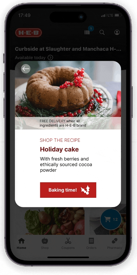
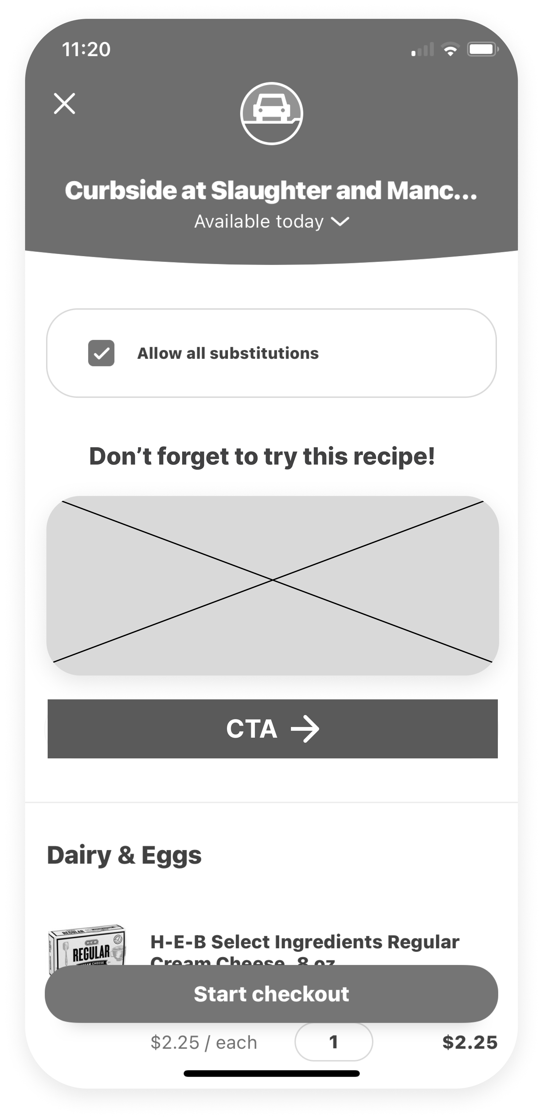
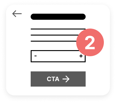
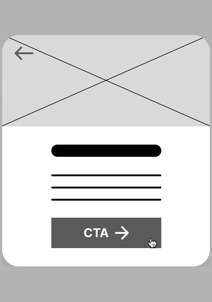
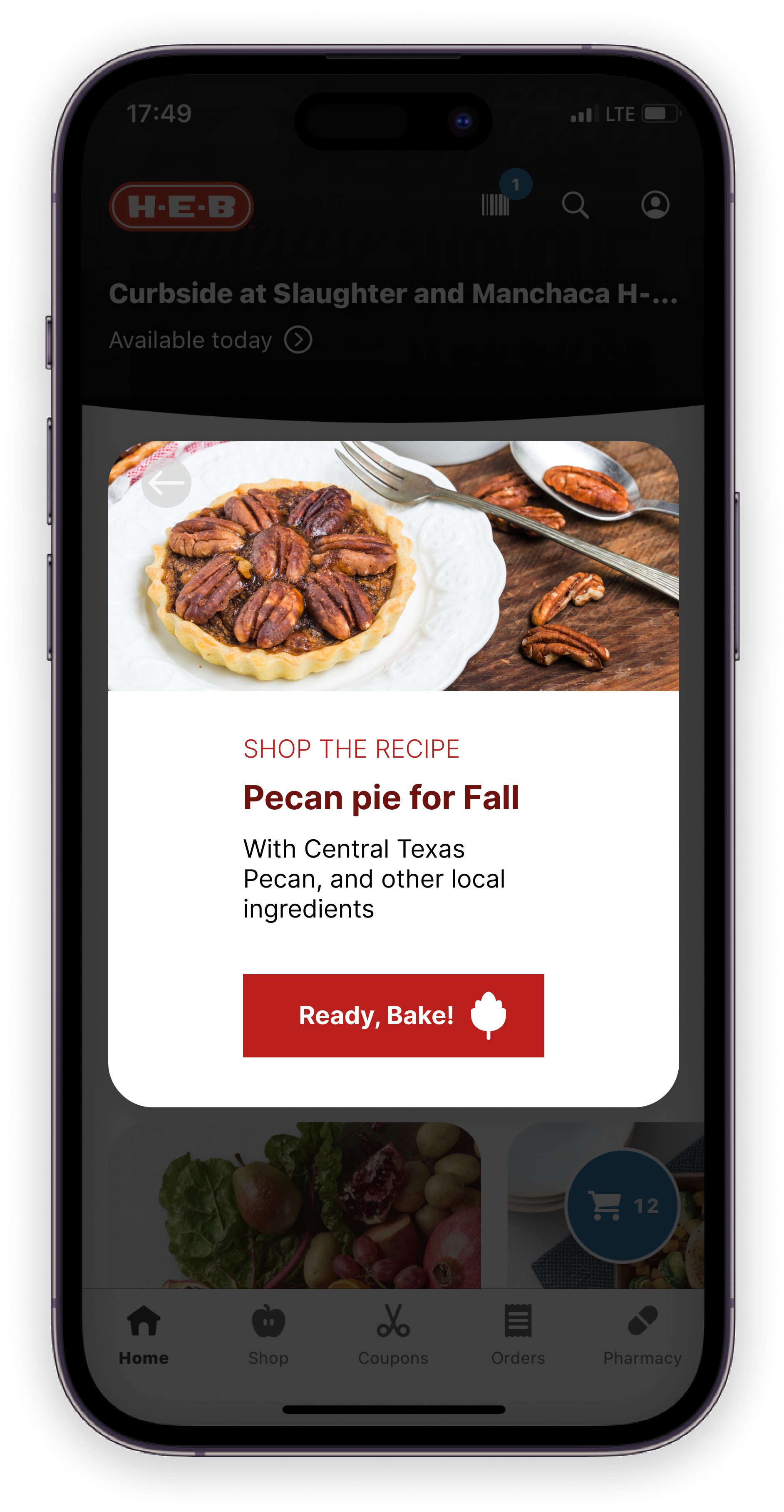
In the initial wireframe, the pop-up walked users through three screens:
Intro: Pop-up appears with an image of the recipe, a brief pitch, and a CTA
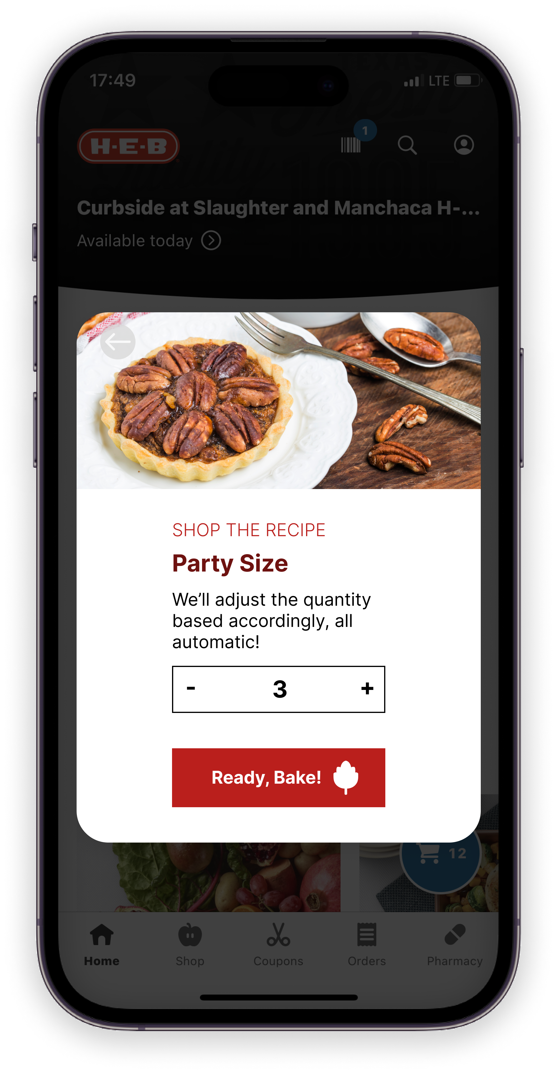
Enter party size: After clicking the CTA, the pop-up presents a default party size that is also adjustable
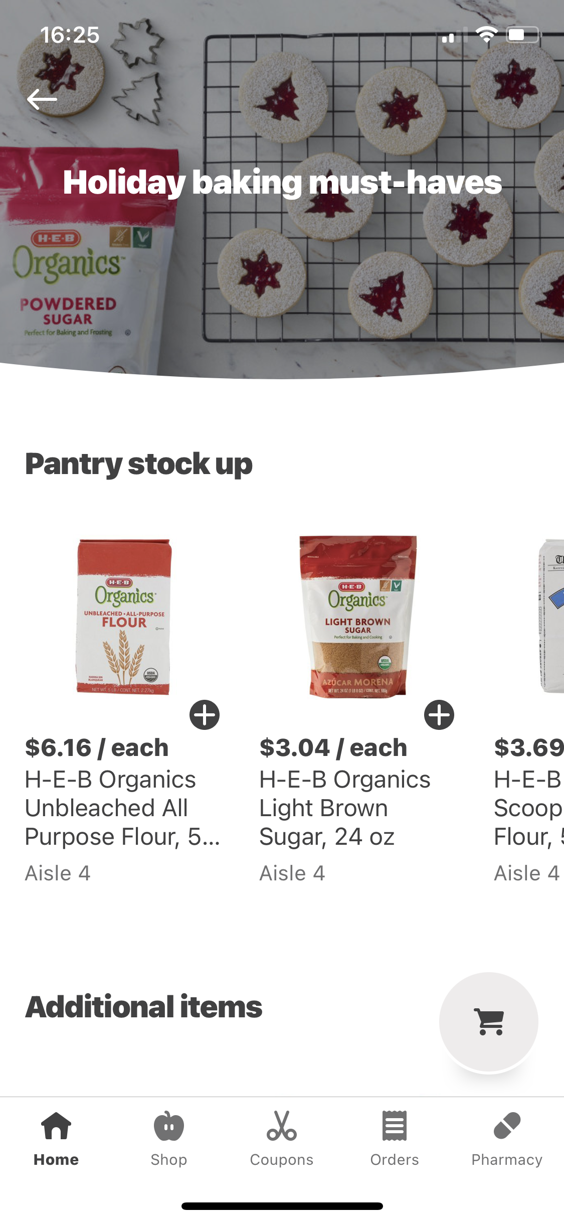
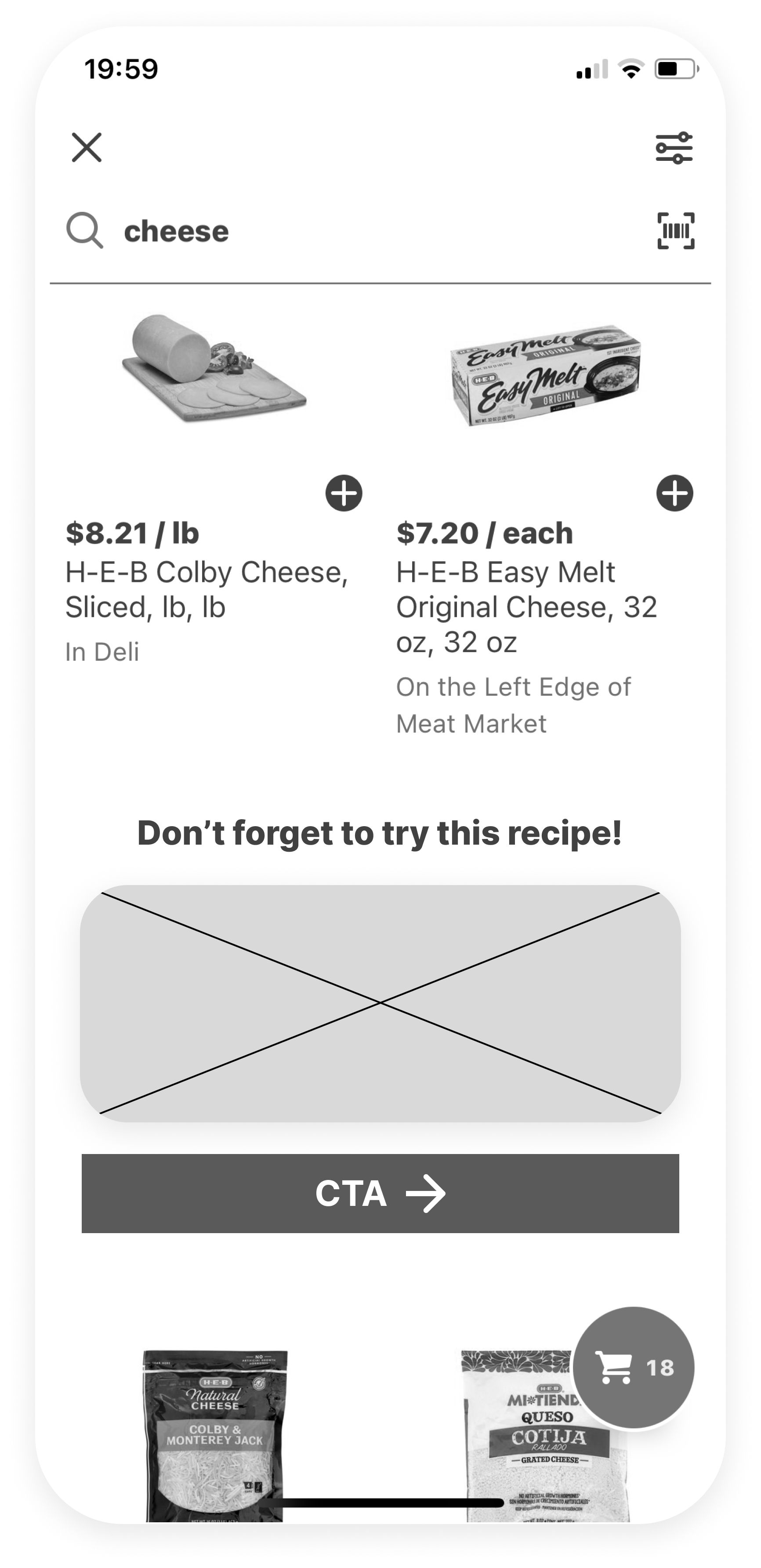
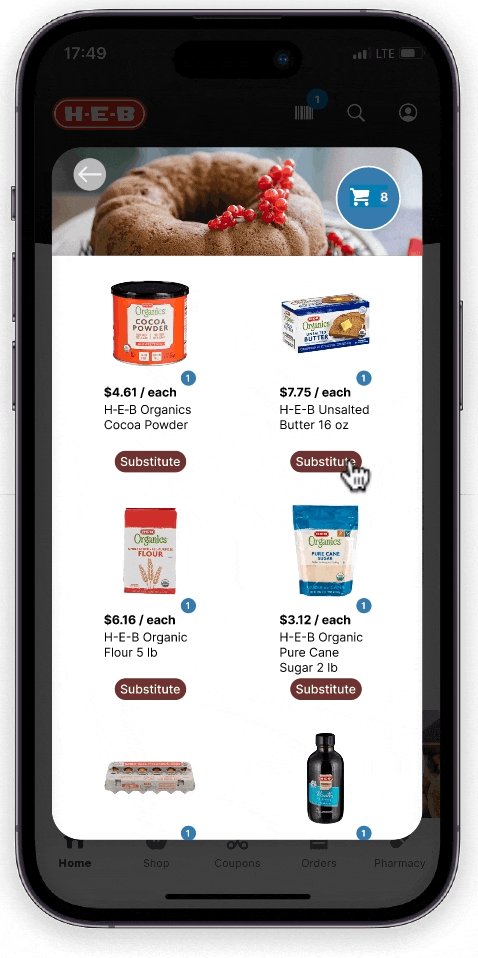
Ingredients list: The window lists all ingredients, with quantity adjusted to defined party size. Then a CTA to add everything into the cart.


To make the pop-up stand out more and feel more relevant, I tried a few design and placement options for the CTA buttons while keeping the pattern consistent with the current app. The design with an themed icon received the best feedback.

CTA placement and content evolution
To reduce user clicks, cognitive load, and save more time, I tried to eliminate the second screen (enter party size), and go from first (intro) to the third screen (ingredients list) with a default party size of 3.
But user feedback suggested that the default party size can be overlooked on the third screen. After changing the party size on the ingredients screen, then watch all the items’ quantity change can be confusing.
This approach was also not preferable from a developer perspective. Since the ingredients’ quantities are dependent on party size entered, having multiple numerics refresh at the same time from one input change can potentially cause a weak spot for bugs.
I then modified the design to combine the first 2 screens, so on the first screen (intro), after clicking the CTA, the enter party size input field appears on the same screen.
Wireframe:
Shop from all brands
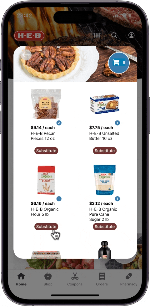
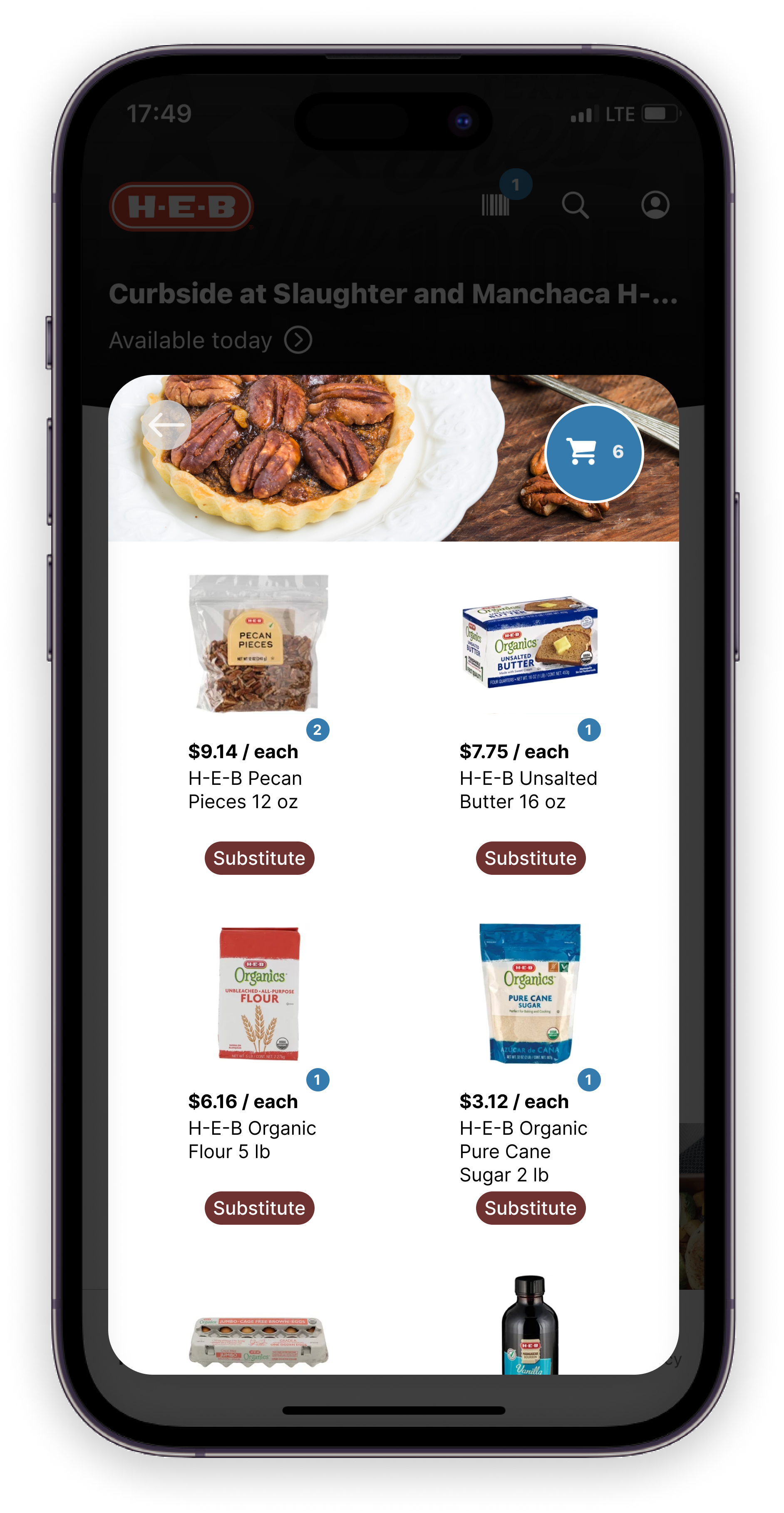
On the third screen (ingredients list), all items were defaulted to H-E-B brands, however, user expressed they sometimes prefer a specific brand. I then designed an alternative feature to accommodate this habit, and offer better user-control.
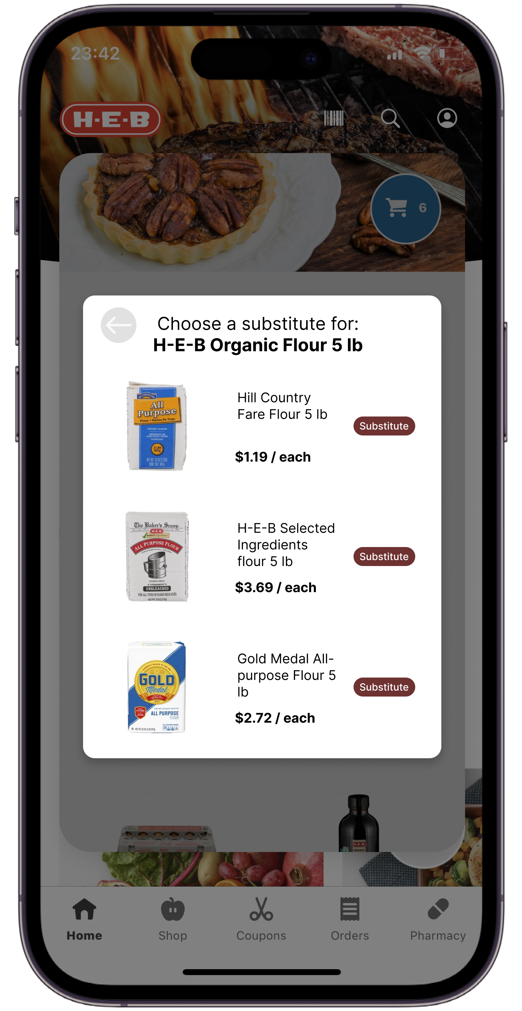
The initial substitution screen was designed as a child window inside the pop-up. During usability sessions, users seemed startled and confused when they saw this.
Showing the substitution items within the same pop-up received much better user feedback.
Initial Prototype:
Fine-tuning the pop-up
With the initial prototype, I gave 6 participants the same task to buy weekly recurring items with new recipe items.
Some participants still looked startled when the pop-up appeared.
Those same participants generally hesitate, then close the pop-up.
The overall click rate was 50%.
To further increase the click rate for this new feature, I wanted to use some pre-purchase guidance to prepare users before the upsell appears.
Iterated prototype:
Lending a helping hand
In the iterated prototype, I included these user recognition elements:
Feature intro on App loading screen
Contextual tutorial

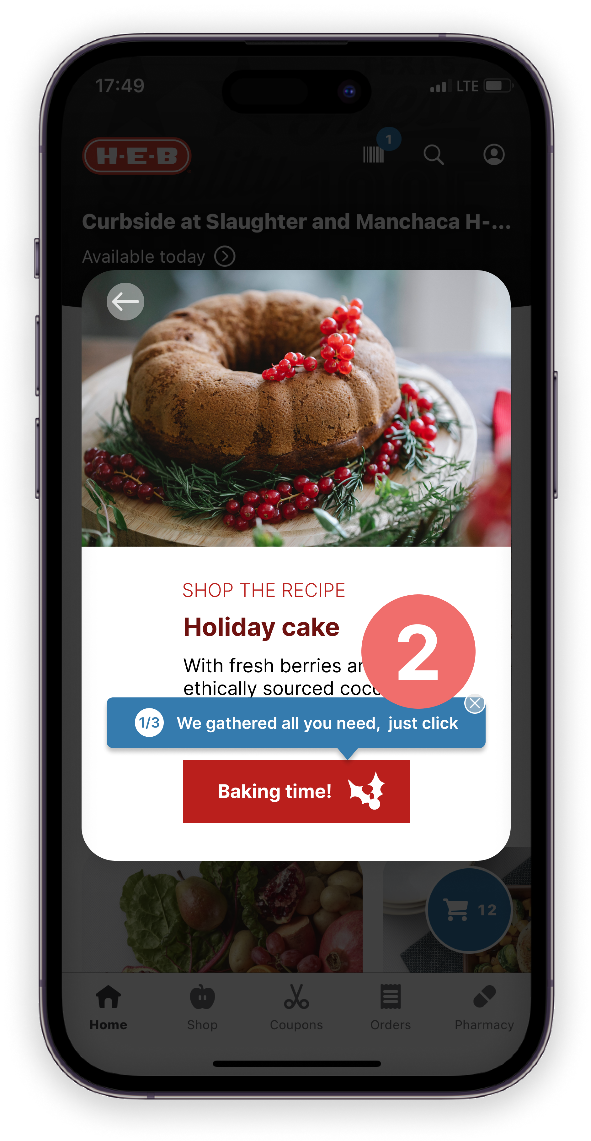
With a new round of usability session with 6 participants, the click rate increased to about 66% with 83% conversion rate.
Validation:
Establish a genuine connection
When asked in interviews, customers generally welcomed the idea of buying all H-E-B brand items in order to get a discount for the whole recipe. Customers also expressed they were looking for something like a special treat from H-E-B, and want to feel like they had a good deal at the end of the day.
To compliment up the upsell, I conceptually came up with the idea of offering free delivery if all items are H-E-B brands or reach a certain total amount to further improve the convenience and time-saving nature of this upsell experience.
Ideally I would like to discuss this and other options with H-E-B’s marketing team to confirm its viability.

This offer was informed to customers in the beginning of the pop-up.
With this modification, I hope to encourage customers to stay in the pop-up, and to further increase conversion rate.

Outcome:
Time for new recipes!
When using the iterated prototype, customers gave great feedback about the pop-up, I saw lots of smiles, participants even jokingly asked “why can’t I book a time?”, “why can’t I check out?” I believe these questions indicated that this experience felt natural, and flows with the current shopping experience.
With this Holiday upsell feature, I expect:
60% increase in upsell conversion rate
10-15% increase in the stores’ online revenue
15-20% more recurring customers
What’s next?
Pop-ups aren’t anything new, and when used at an irrelevant time with irrelevant content, people tend to subconsciously see it as a pushy sales pitch, and drop off without even reading it.
If more resources and access can be granted, I would like to design an in-store, in-person upsell experience that echoes this online pop-up in a format of an interactive booth.
Update April 2023: As I was using the H-E-B app, I have noticed the app has shipped a recipe feature. However the experience is still very limited, such as the ingredient list will have out of stock items listed without offering alternatives. While there could be improvements along the way, I believe H-E-B is on the right direction.